This post describes how to build a doughnut-chart with Tableau based on a calculated percentage (single measure). The first part of this post is showing you how to do this without conditional coloring, while the second part shows you a slightly different approach to enable some conditional coloring in the doughnut.
 For this example we’ll be using a simple data set having 3 products, each with its own sales and costs. With these figures we can easily calculate the products profit margin.
Now create your calculated field that looks like this:
ProfitMargin: (SUM([Sales])-SUM([Cost]))/SUM([Cost])
Usually when creating pie-charts or doughnut-charts you would use a category field but in this case we can’t use that because we don’t have any categories for our data. Therefore we need to create a second calculated field to fill in the rest of our doughnut chart
RestProfitMargin: 1-[ProfitMargin]
Creating a doughnut chart with no specified color-indicator.
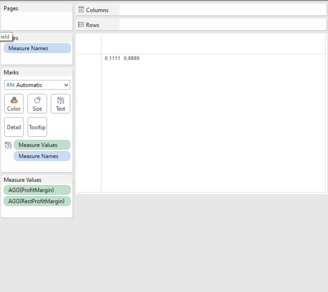
In the standard doughnut you drag your “Measure Values” into your Text Mark and your “Measure Names” into your Detail Mark. Now remove all measures except for our ProfitMargin and RestProfitMargin. It should look like this now:
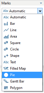
Now select the Mark Type Pie.
And now you have your Pie Chart:
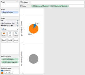
For turning this into a doughnut chart we can easily add a measure into our row-section. I’m using the “MIN(Number of Records)” or you could you use a constant value for this. Just make sure both row measures have the same value.
As you can see, Tableau has made this into a Multiple Mark Type visualization. For the second Mark remove the objects of the Color Marks, Angle Marks and Label Marks. Modify the Size Mark and make it slightly smaller. (Maybe you can set default color to white)
Now you can right-click the second row measure and make them Dual Axis. Et voila, you’ve got your doughnut chart. Just clean up labels, hide headers and format your measures and you’re good to go.
How to setup conditional coloring in single measure doughnut chart.
To do so we need to create some (new/additional) calculated fields:
PositiveProfitMargin:
IF [ProfitMargin] >= 0 THEN [ProfitMargin] END

PostitiveRestProfitMargin:
IF [ProfitMargin] >= 0 THEN 1-[ProfitMargin] END

NegativeProfitMargin:
IF [ProfitMargin] < 0 THEN [ProfitMargin] END

NegativeRestProfitMargin:
IF [ProfitMargin] < 0 THEN 1-[ProfitMargin]
The calculations will return nothing or NULL if criteria is not true.
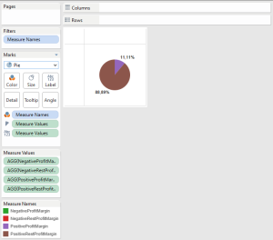
Now do the same actions as a described in the first part using these 4 measures.
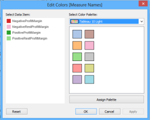
Because of the multiple measures we can now specify our color on the different measure. Edit colors of the [Measure Names]
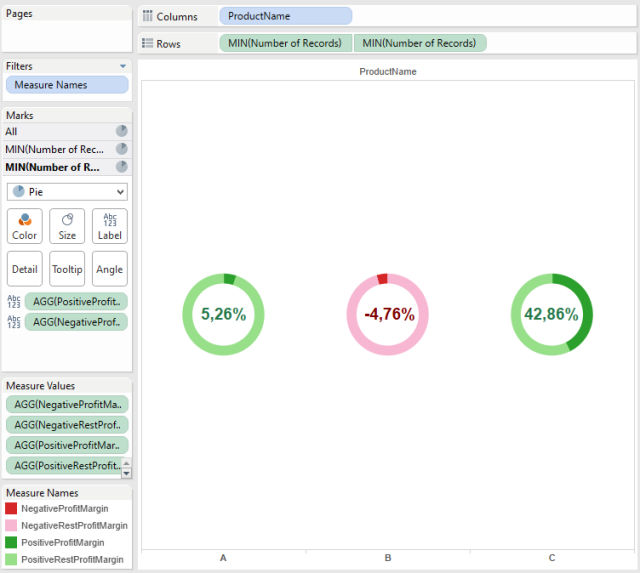
If you add the ProductName on the columns you would get this result:
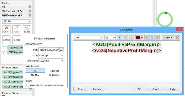
We can show the actual ProfitMargin in the inner circle of the doughnut chart and use the same conditional coloring. Simply add PositiveProfitMargin and NegativeProfitMargin to the Label Mark. Now edit the labels and add color to each of the labels.
The result:




Hi,
I was testing this method and my use case is a little bit different than this. I want to show the percentage of the value.
If it’s less than 30% (low), I want to show red color.
If it’s greater than 30% and less than 60% (medium), I want to show orange color.
If it’s greater than 60% (high), I want to show green color.
So I created 6 calculated fields and but all are showing on Pie instead of showing one respective color. How to filter out or hide the other 5 colors (5 slices of Pie)?
LikeLike
Dear Yin,
About showing only 1 measure, you need to make sure that when the value is not relevant or applicable you return NULL to the result of your calculation.
That way, only the applicable value and color will be shown in the pie chart.
But….
once you start having too many different ranges and colors you might want to consider creating a separate visualization for it, instead of creating a new measure for each result.
In the object you would create a plain text visualization and set the color logic on your color marks.
In your dashboard you can stack the new visualization floating on top of you doughnut chart.
Both solution will be the same from an end-user point-of-view.
Let me know if this was helpful or not
LikeLike